


Beyond Books
Logo Design
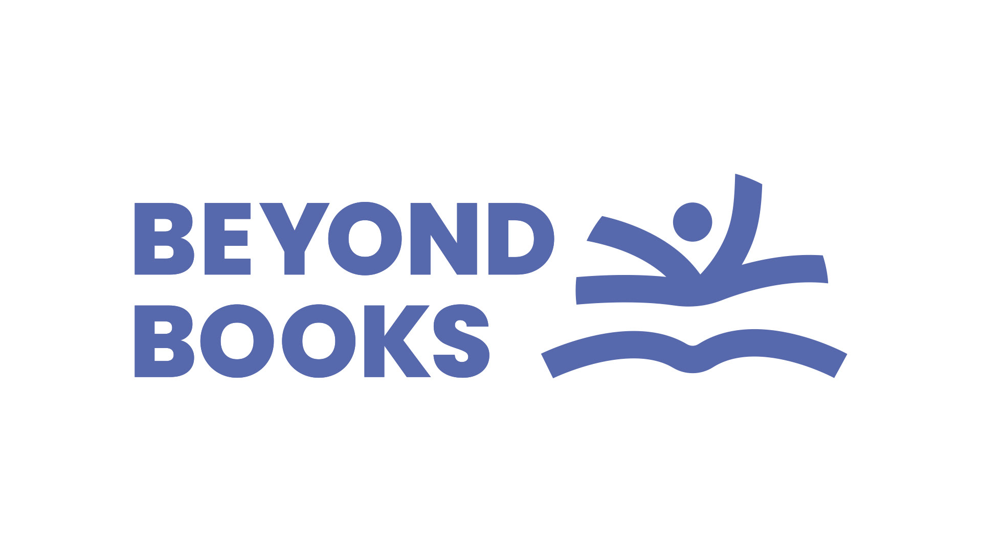
Offering personal tuition for students aged 5 to 17, Beyond Books needed a brand that reflected their supportive, dynamic approach to learning. My main challenge was creating a logo that would appeal to two very different audiences. It needed to be bright and friendly for young learners, while keeping it confident and trustworthy for parents.
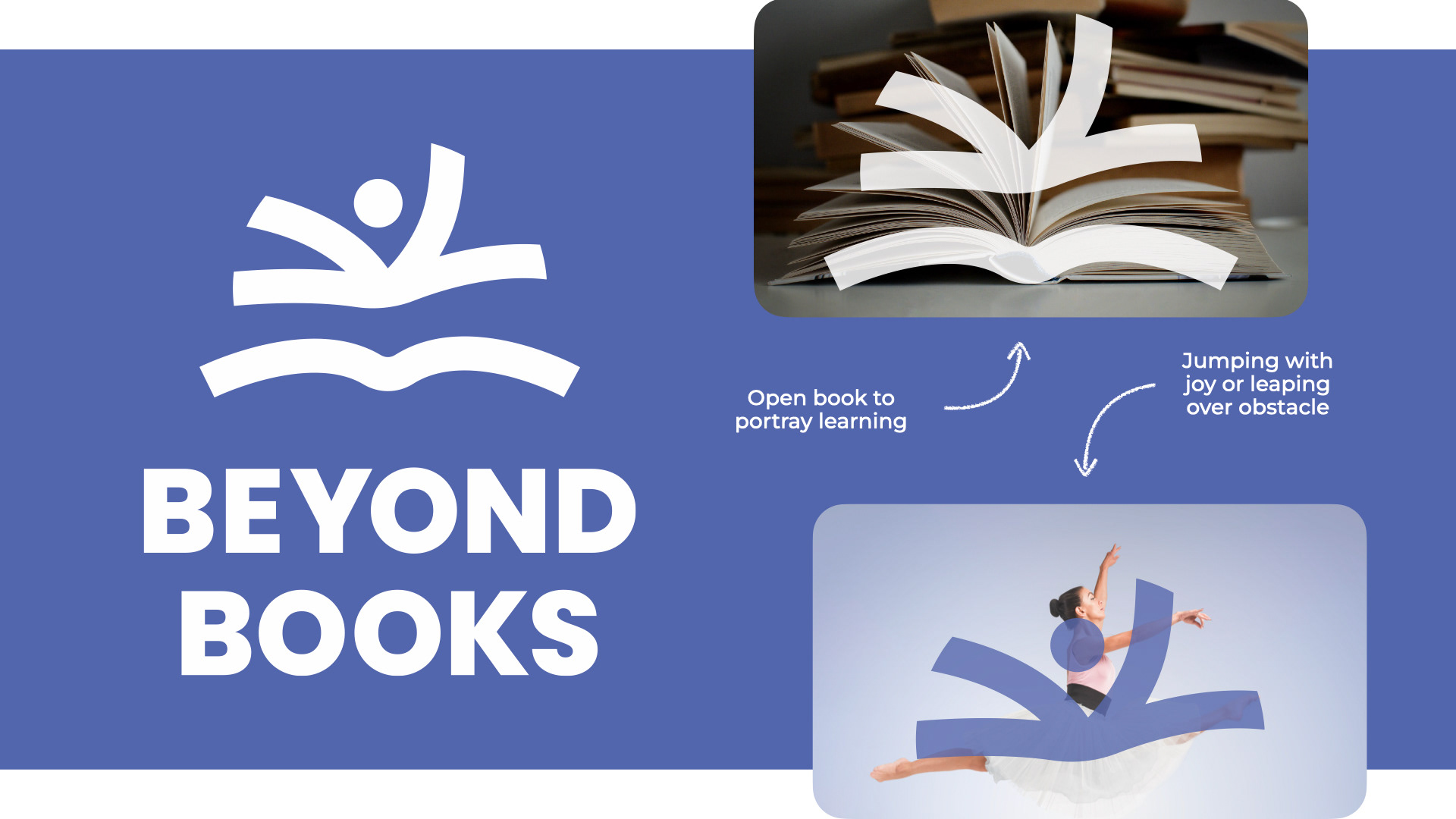
I created an abstract mark with a double meaning. It firstly looks like pages of a book being turned over, but also forms a figure leaping forward to represent student progress. Combined with bold typography and a rich colour palette, it brings plenty of warmth and energy to the brand without feeling overly childish.
The resulting identity feels fresh and full of life, giving Beyond Books a strong, versatile foundation as they continue their mission to help every student grow.