


Promoting a Quaint HistorIc Town to the World
My Tenterden, a website showcasing local businesses and events in the historic town of Tenterden, was in need of a visual identity that captured the town’s quaint charm, rich history, and scenic beauty. The aim was to create a logo that would resonate with both residents and visitors, while remaining adaptable across a range of platforms.
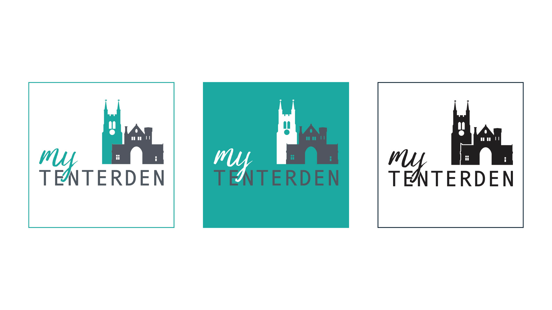
Tenterden is steeped in history, with a heritage steam railway and over 200 listed buildings along its High Street. Drawing on this, I brought together two of its most iconic landmarks into a single logomark, St Mildred’s Church and Heronden Hall Gatehouse.
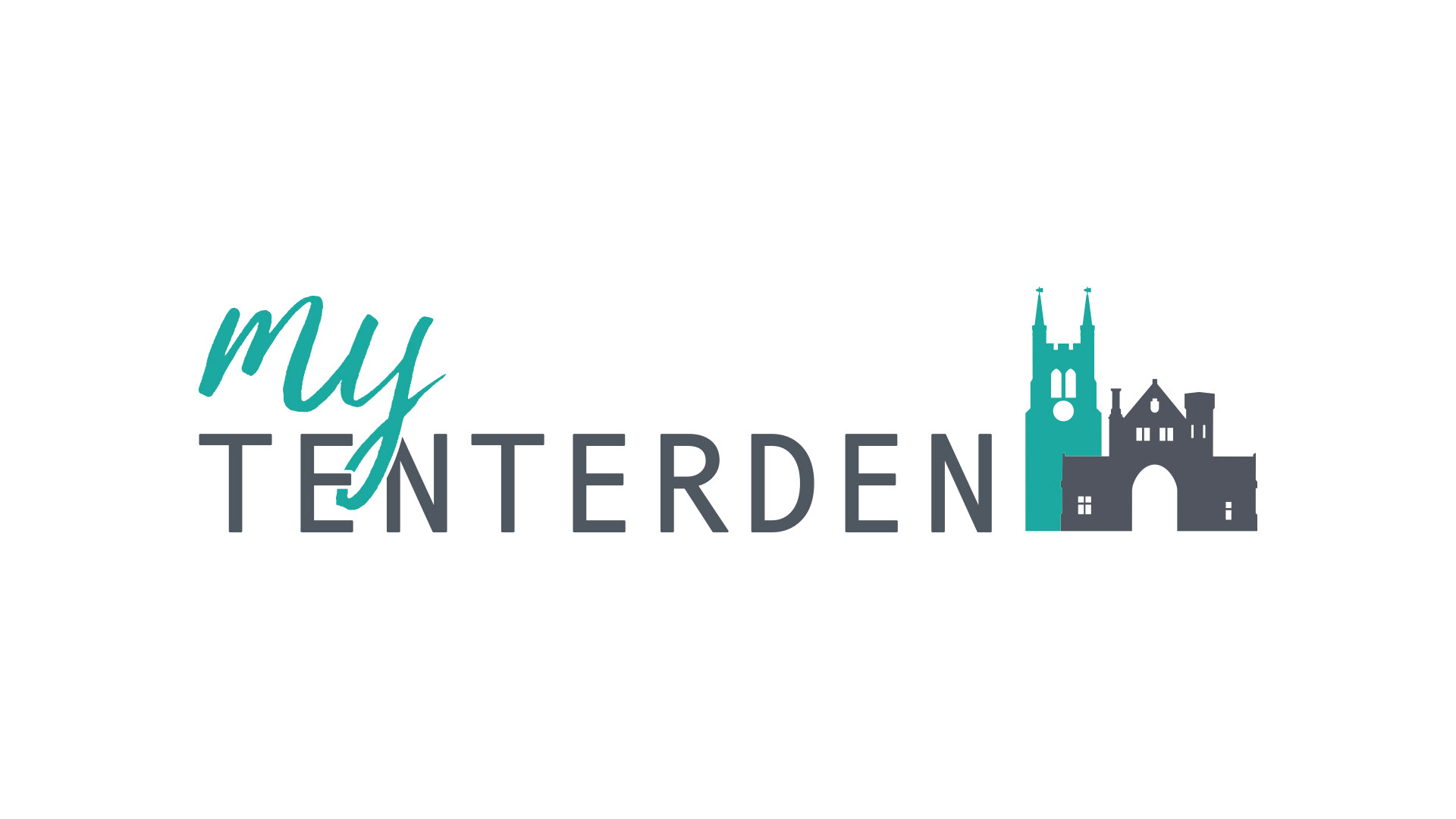
The font pairing used for the wordmark represents the people and businesses of the town. The softer script font used for “My” reflects the residents, while the more structured sans serif typeface used for “Tenterden” represents the local businesses.

To complete the identity, I selected a fresh and vibrant colour palette inspired by the surrounding natural landscape. The result is a cohesive and versatile visual identity that works effectively across both digital platforms and printed materials.