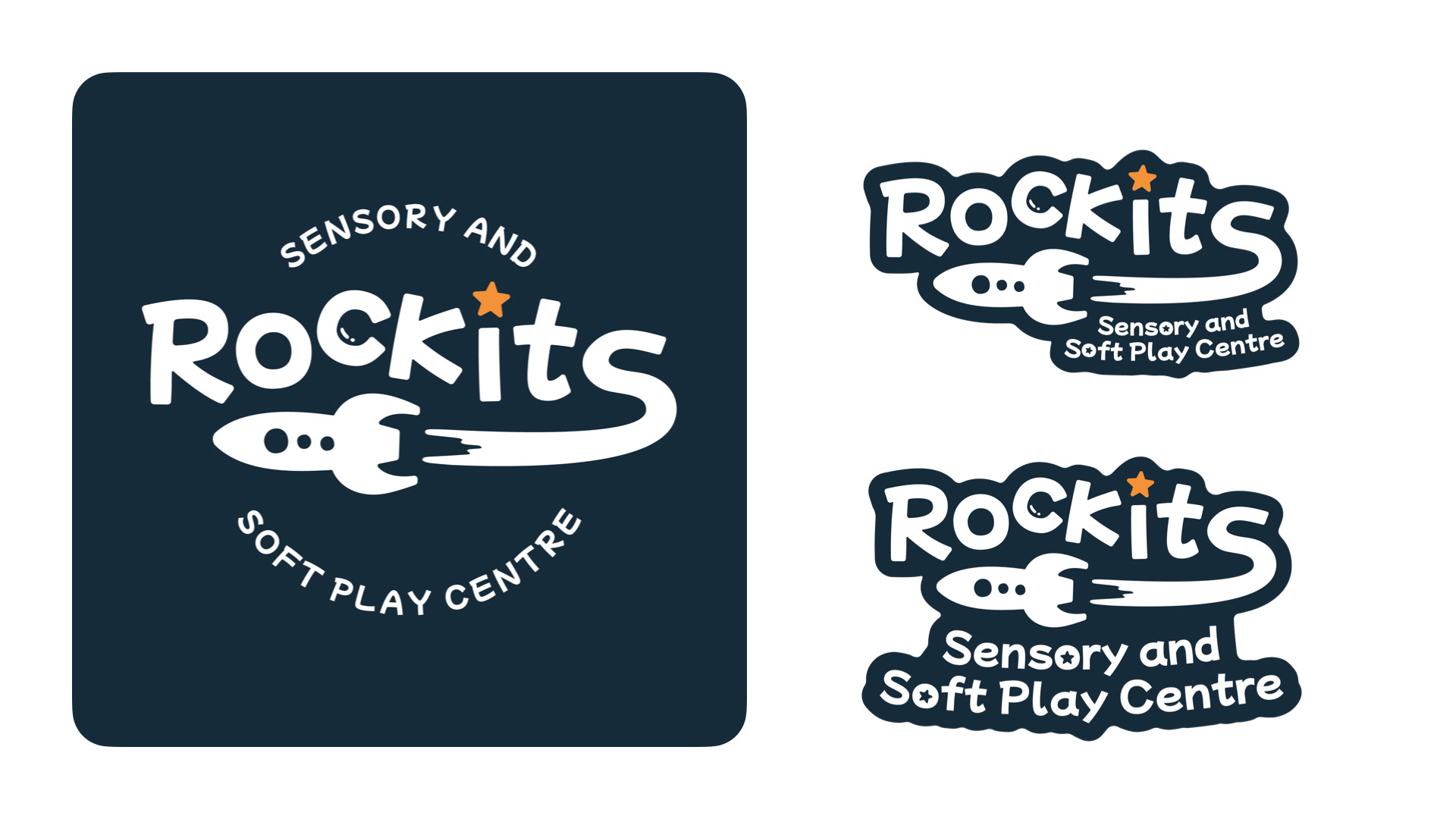


Launching a brand where play and inclusion meet
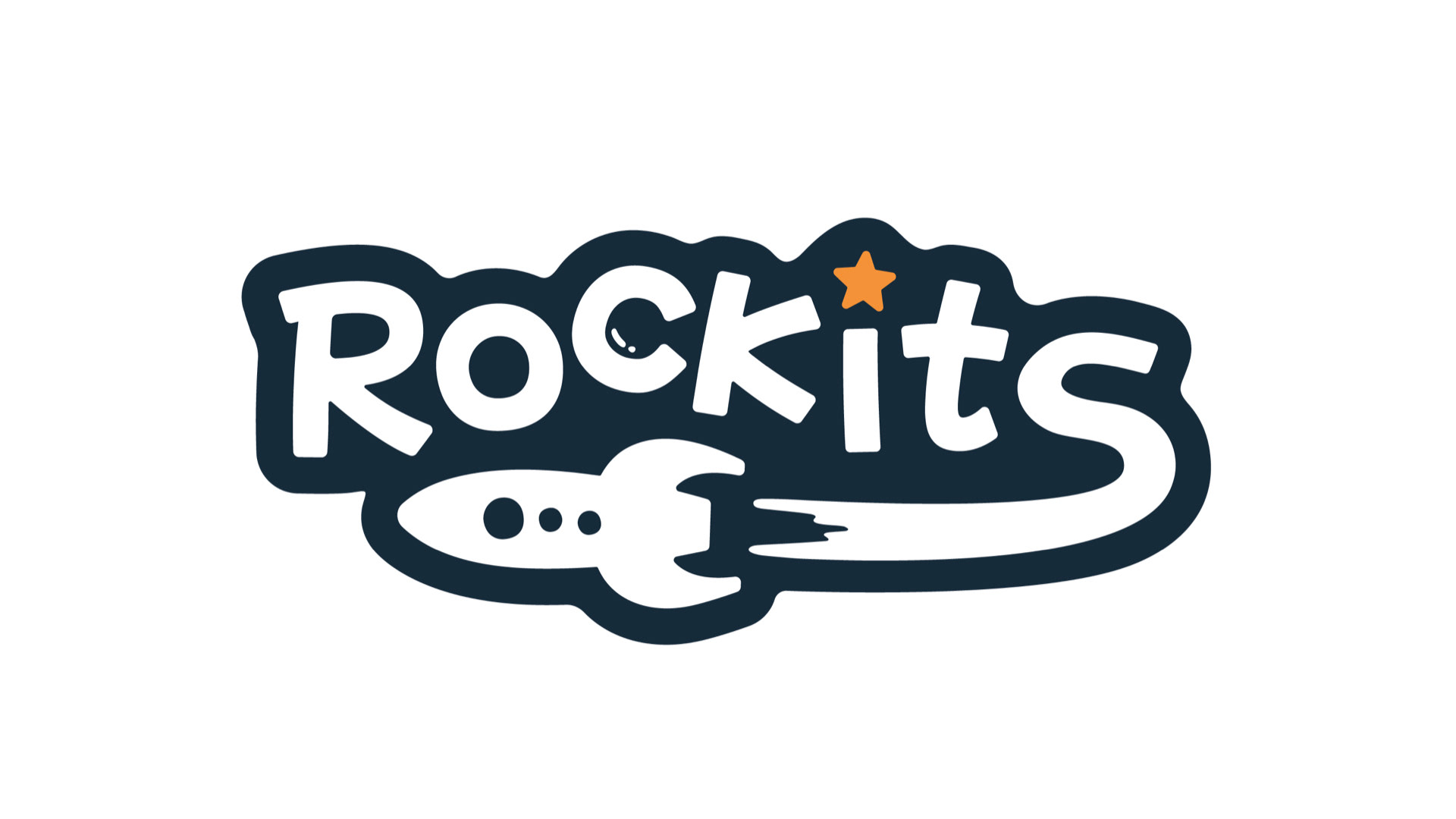
As Rockits Sensory and Soft Play Centre grew and prepared to move into new larger premises, they required a refreshed visual identity to better reflect their ambition to become Kent's first fully inclusive support hub and play centre for children. They wanted a logo that was fun, vibrant and adaptable, and that resonated with a young audience.
I wanted to build a brand that felt playful, friendly, energetic and full of personality, one that would appeal to both adults and children, including those with diverse sensory needs. Through the use of vibrant colours and simple shapes, I struck a balance between fun and reassurance, ensuring the brand feels exciting without being overwhelming.
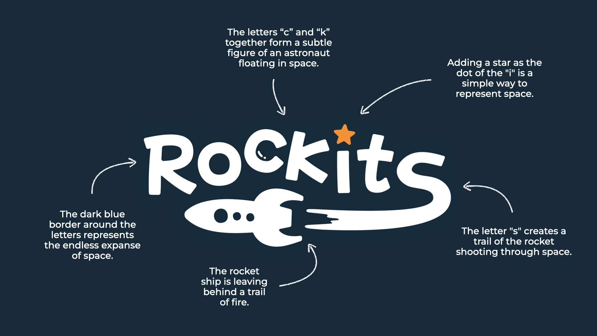
Working with the space theme I included little details that give the logo more personality. The rocket trail coming from the “s” adds energy and movement, the dot on the “i” is turned into a star for a simple space reference. I also worked the shapes of the “c” and “k” to hint at an astronaut floating in space. It’s a small hidden detail, but one that adds a bit of fun storytelling to the design. The client especially loved the addition of the astronaut, as it gave the logo an extra layer of charm and makes it more memorable.